_LinkedIn UX/UI Creative
What if the #1 career networking site was designed for visual creatives?

A Homepage for Creative Discovery
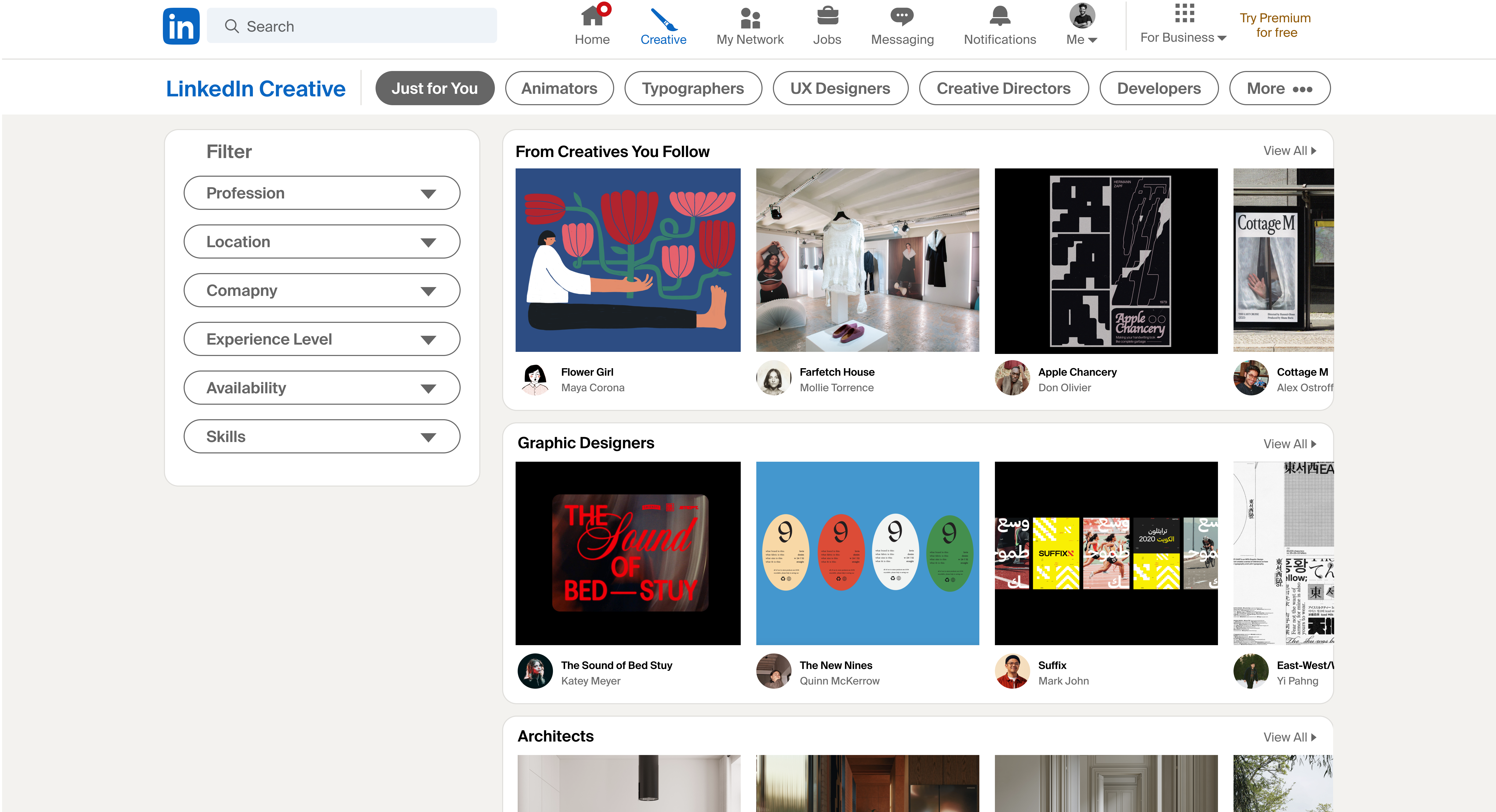
Users navigate to the LinkedIn Creative offering via the ‘creative’ button in the top navigation bar. Carousel galleries featuring creative projects and their makers are organizable by industry, location, experience level, and skills.

Profile Portfolio
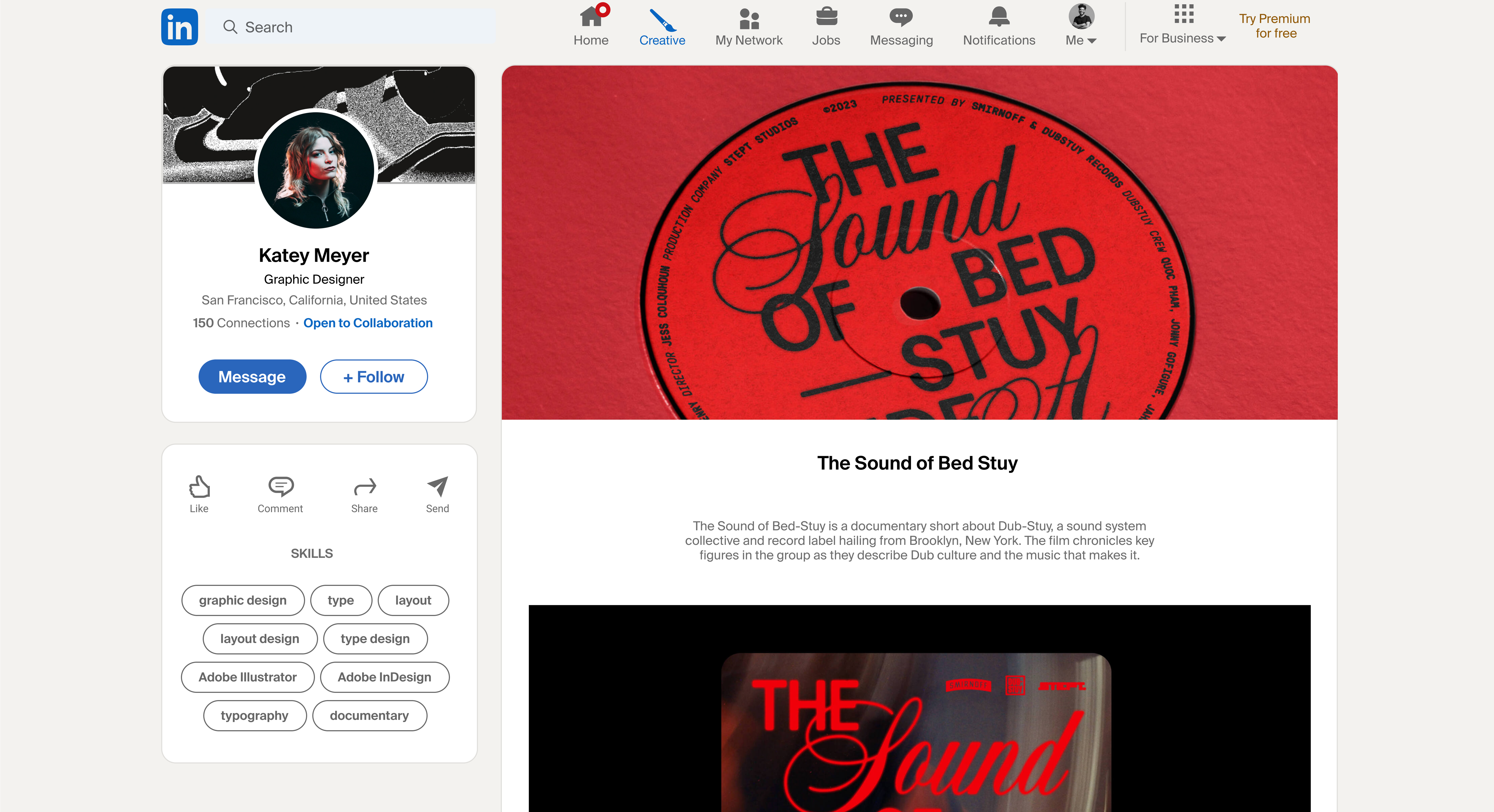
Creatives are able to express themselves and connect with community in a meaningful, passionate way through their profiles. Profiles boast ample space for project showcasing, creatives’ skills, custom privacy settings, and messaging and tagging features.
![]()
![]()
Profile Portfolio
Creatives are able to express themselves and connect with community in a meaningful, passionate way through their profiles. Profiles boast ample space for project showcasing, creatives’ skills, custom privacy settings, and messaging and tagging features.

Customization and Privacy
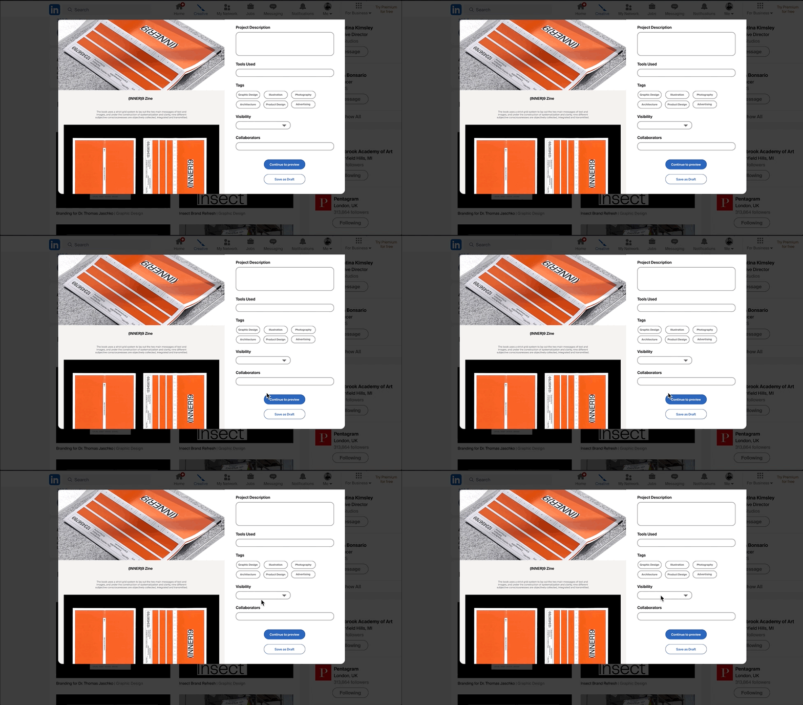
Customizable media blocks allow users to upload videos, photos, audio, and text. They can also tag collaborators and customize privacy settings for each project.

Overview:
Discovery
+ Market Research
+ C&C Feature analysis
+ User Interviews
+ Task Analysis
Define+ Affinity Mapping
Problem Statement
Design
+ How Might We...?
+ User Flows
+ Usability Testing
Prototype
Reflections
Discovery
+ Market Research
+ C&C Feature analysis
+ User Interviews
+ Task Analysis
Define
+ Affinity Mapping
+ Personas
+ Task Analysis
Problem Statement
Design
+ How Might We...?
+ User Flows
+ Usability Testing
Prototype
Reflections
︎ Case Study
LinkedIn is a renowned job search social network, with 930 million users in 200+ countries and territories worldwide. As a platform built for non-creative users, visual creatives on LinkedIn struggle to display their work on the platform.
The Opportunity:
“While LinkedIn remains a secure and promising resource for job-seekers, the way in which creative users are allowed to present their work-selves is still very much rooted in an older generation of job searching. LinkedIn is essentially a dynamic, hyperlinked resume. As such, people in creative, technical, and craft-based industries are limited in the content they can showcase. Most often, these users will be forced to host any sort of visual, animated, or coded work on another website, like a personal portfolio or Github Repository.
LinkedIn wants to create a tool for makers to show off their work - by displaying projects, rich media, and more in a meaningful way, without relying on an external portfolio like Squarespace.”
My Role:
As a multi-disciplinary designer with a background in visual arts and technical entrepreneurship, I went into this project especially excited by the subject mater–adapting a traditional business service to modern creative needs. As a Black creative woman, passionate about inclusivity in our ever-evolving world, my personal aim was to promote a diversely considerate design for LinkedIn’s makers and creative users.
Solution:
The final design soultion adds a creative user oriented mode to the site, called LinkedIn Creative. LinkedIn Creative is accessed through the main menu, with a distinctive button. This offering works within Linkedin’s existing UI design framework, providing creatives with a seamless experience that supports their unique career needs.
Tools:
+ Market Research
+ C&C Feature analysis
+ User Interviews
+ Task Analysis
+ Market Research
+ C&C Feature analysis
+ User Interviews
+ Task Analysis
︎ Discovery
To begin, I delved in to market research on how LinkedIn’s offerings measured up against other networking and portfolio sites. I studied their competitors and comparators, the lives of creative users who use LinkedIn, and how those users felt moving through work sharing and job networking experiences overall. This information would help me to craft a competitive and empathetic edge for the design effort.
︎ Market Research
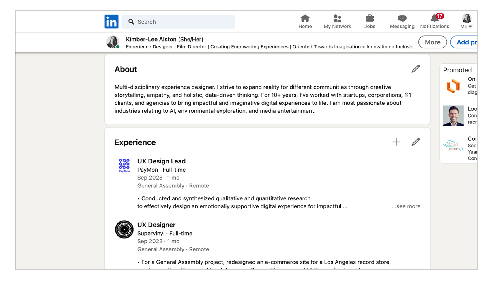
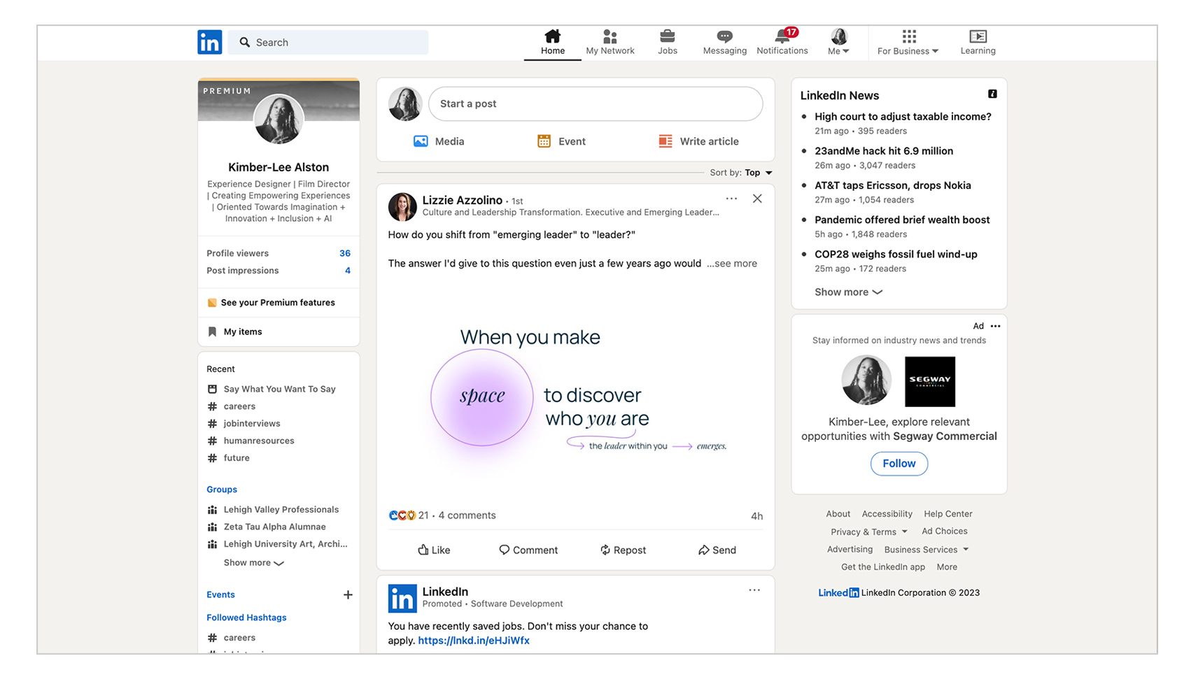
In documenting the initial design of LinkedIn’s work sharing affordances, I noted that the UI prioritized traditional text résumés and in-feed post updates. Creatives could share media and links in their feed posts. Those posts would be also accesible in in-line format on their profiles. These sharing offerings, although better than nothing, did not seem to offer anything on the cutting edge of meaningfully showcasing rich creative projects and media-rich visuals. They were notably traditional.
![Traditional Résumé.jpg]()
![Post Updates.jpg]()
![Post Activity.jpg]()

︎ C&C Insights
Other traditional job-networking sites like Monster, Indeed, and Upwork were also lacking in features that allowed creatives to amply and meaninfgully share their work. Like LinkedIn, they offered comparable basic job application features. Unlike LinkedIn, however, these sites lacked socal networking and community building capabilities.
Comparator platforms like Instagram, Dribbble, and Behance boasted social networking features that felt deeply supportive of creatives. These sites focused on creative’s experiences, similar to how LinkedIn focused on traditional (non-creative) career experiences.
Comparator site features included:
+ Highly visual multi-media portfolio offerings
+ User profiles that allowed for significant personal expression
+ Community building offerings with meaningful opportunities for connection
+ Native job application features (on select platforms)
+ Discovery and browsing capabilities allowed users to find new, inspiring work
![Market Research.txt]()
Comparator platforms like Instagram, Dribbble, and Behance boasted social networking features that felt deeply supportive of creatives. These sites focused on creative’s experiences, similar to how LinkedIn focused on traditional (non-creative) career experiences.
Comparator site features included:
+ Highly visual multi-media portfolio offerings
+ User profiles that allowed for significant personal expression
+ Community building offerings with meaningful opportunities for connection
+ Native job application features (on select platforms)
+ Discovery and browsing capabilities allowed users to find new, inspiring work

k
︎ Interview Insights
I conducted 12, 1:1 user interviews with a diverse array of creatives, who were familiar with LinkedIn. I had in-depth conversations with mid-career architects, film directors based in Los Angeles, graphic designers living in San Francisco, and recruiters searching for talent remotely. I intentionally spoke with a diverse array of makers and creatives, to ensure that the design process was inclusively supportive. My design choices would account for a dynamic selection of users’ needs.
Many of the conversations that I had, echoed my C&C analysis discoveries. Interviewees touched on discovery and inspiration, community building, site customization and personalization. And, LinkedIn’s status as the premier traditional career site.
![]()
![]()
![]()
![]()
![]()
![]()
Interview Quotes:
+ “I usually look for inspiration by checking out other artists' work on platforms like Instagram.“
+ “Posting frequently helps me to build a core audience, and that’s really important.
+ “Being part of the artist community is important to me,.”
+ “I like templates, they are pretty customizable. You can make them pretty unique.”
+ “For showcasing creative work, I direct people to my Behance profile.“
+ ”LinkedIn is the most user-friendly job application site.” +≠
+ “I would love to able to connect to jobs with an easy way to share my portfolio.”
Many of the conversations that I had, echoed my C&C analysis discoveries. Interviewees touched on discovery and inspiration, community building, site customization and personalization. And, LinkedIn’s status as the premier traditional career site.



Interview Quotes:
+ “I usually look for inspiration by checking out other artists' work on platforms like Instagram.“
+ “Posting frequently helps me to build a core audience, and that’s really important.
+ “Being part of the artist community is important to me,.”
+ “I like templates, they are pretty customizable. You can make them pretty unique.”
+ “For showcasing creative work, I direct people to my Behance profile.“
+ ”LinkedIn is the most user-friendly job application site.” +≠
+ “I would love to able to connect to jobs with an easy way to share my portfolio.”
Tools:
+ Affinity Mapping
+ Personas
+ Task Analysis
+ Affinity Mapping
+ Personas
+ Task Analysis
︎Define
With ample information from discovery–on the existing UI, portfolio and networking site features, and community needs–I moved into the define phase. My objective here was to further glean and organize themes and insights from collected data.
︎ Affinity Trends
In synthesizing interviews, I cemented creative users’ values and needs into the following.
+ Discovery: Looking through other creatives’ work to spark inspiration and collaboration. On the recruiting side: Viewing work samples to vet talent for hire.
+ Community: Building felt connections that center passions, growth, and support.
+ Customization: Freedom around what kind of media can be shared in online portfolios.
+ Privacy: Options to exclude current industry employers (and colleagues) from viewing analamous creative posts.
+ Aligned Opportunities: On the recruiting side: Finding the most skilled, qualified talent for a role. On the creative user side: Attracting aligned, resonant opportunities.
From these focused values and needs, in combination with the breadth of sensory, emotional data I gathered from interviews, I went on to develop both high-level and deep-dive personas.
![Affinity Map.jpg]()
![High Level Personas.jpg]()


︎ Personas
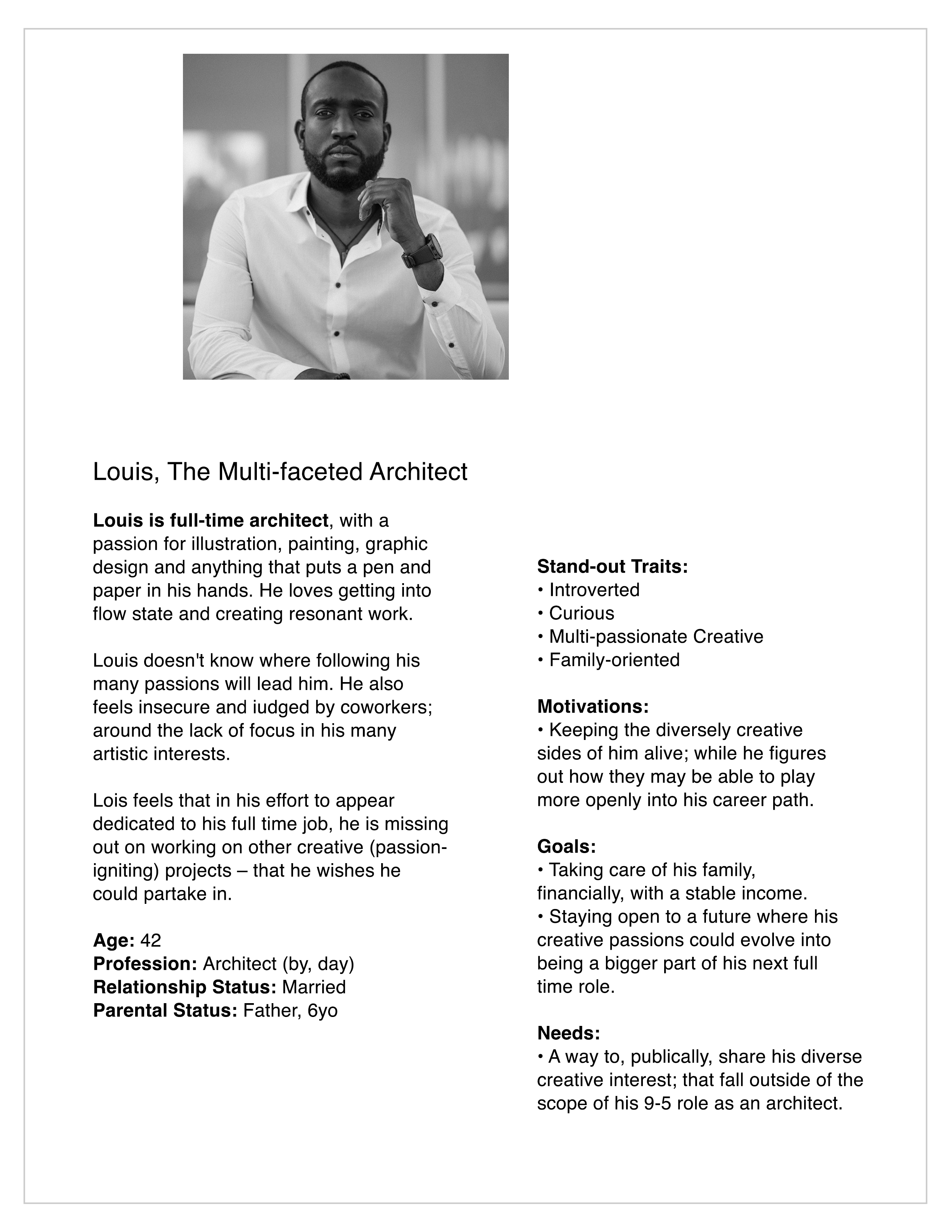
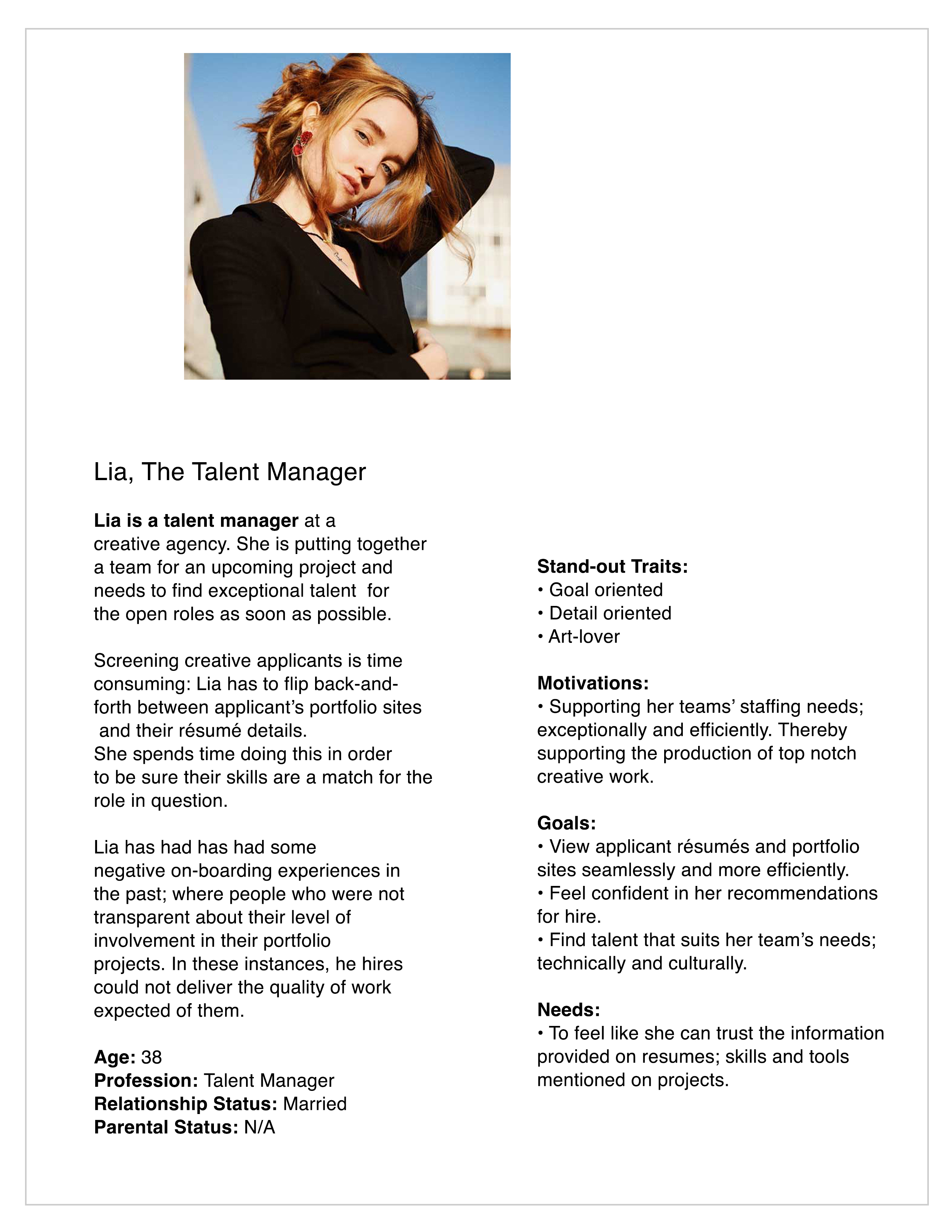
Similar to the high level personas, the deeper personas were based carefully on the diversity of the individuals interviewed. Louis, the primary persona, is a multi-faceted architect. In contrast, Lia, the secondary persona, is a talent manager. Working with contrasting and complimentary user perspectives, around the subject of developing offerings for creative users, allowed me to comprehensiely and holistically address values and needs.
![Primary Persona.docx]()
![Secondary Persona.docx]()
︎Task Analysis
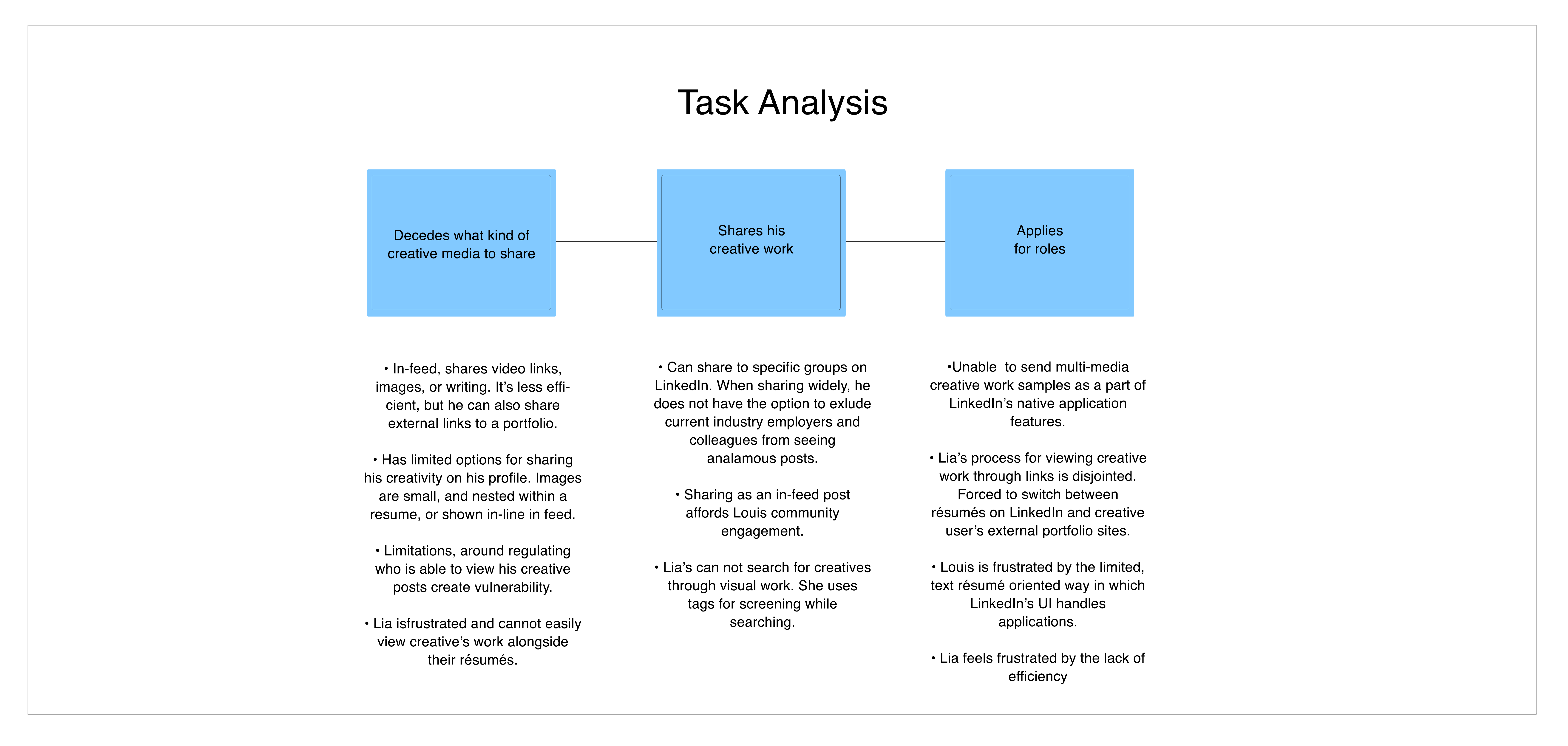
With complementary personas fleshed out, I performed a task analysis.
This helped to better understand how limited users felt when sharing creative work and seeking aligned opportunities. It also helped me to keep in mind what options were already afforded to users.
![Task Analysis.jpg]()
Within the existing UI, Louis has the option to share video links, photos, illustrations, or writing in his feed. Although less efficient, Louis can also share external links to a portfolio siteThe opportunity to engage with community, through his in-feed posts, feels exciting!
Louis has limited options for sharing his creativity on his LinkedIn profile. Images there are either very small, and nested within a traditional resume, or shown in-line as feed posts, under the ‘posts’ tab. Furthermore limitationsaround regulating who is able to view his creative posts, create feelings of vulnerability for Louis.
Talent managers like Lia’s do not have an option to search for creatives through their visual work. Lia can, however, use tags for screening while searching. Still, she feels frustrated that she cannot easily view creatives’ work alongside their résumés.
This helped to better understand how limited users felt when sharing creative work and seeking aligned opportunities. It also helped me to keep in mind what options were already afforded to users.
Within the existing UI, Louis has the option to share video links, photos, illustrations, or writing in his feed. Although less efficient, Louis can also share external links to a portfolio siteThe opportunity to engage with community, through his in-feed posts, feels exciting!
Louis has limited options for sharing his creativity on his LinkedIn profile. Images there are either very small, and nested within a traditional resume, or shown in-line as feed posts, under the ‘posts’ tab. Furthermore limitationsaround regulating who is able to view his creative posts, create feelings of vulnerability for Louis.
Talent managers like Lia’s do not have an option to search for creatives through their visual work. Lia can, however, use tags for screening while searching. Still, she feels frustrated that she cannot easily view creatives’ work alongside their résumés.
︎Problem Statement
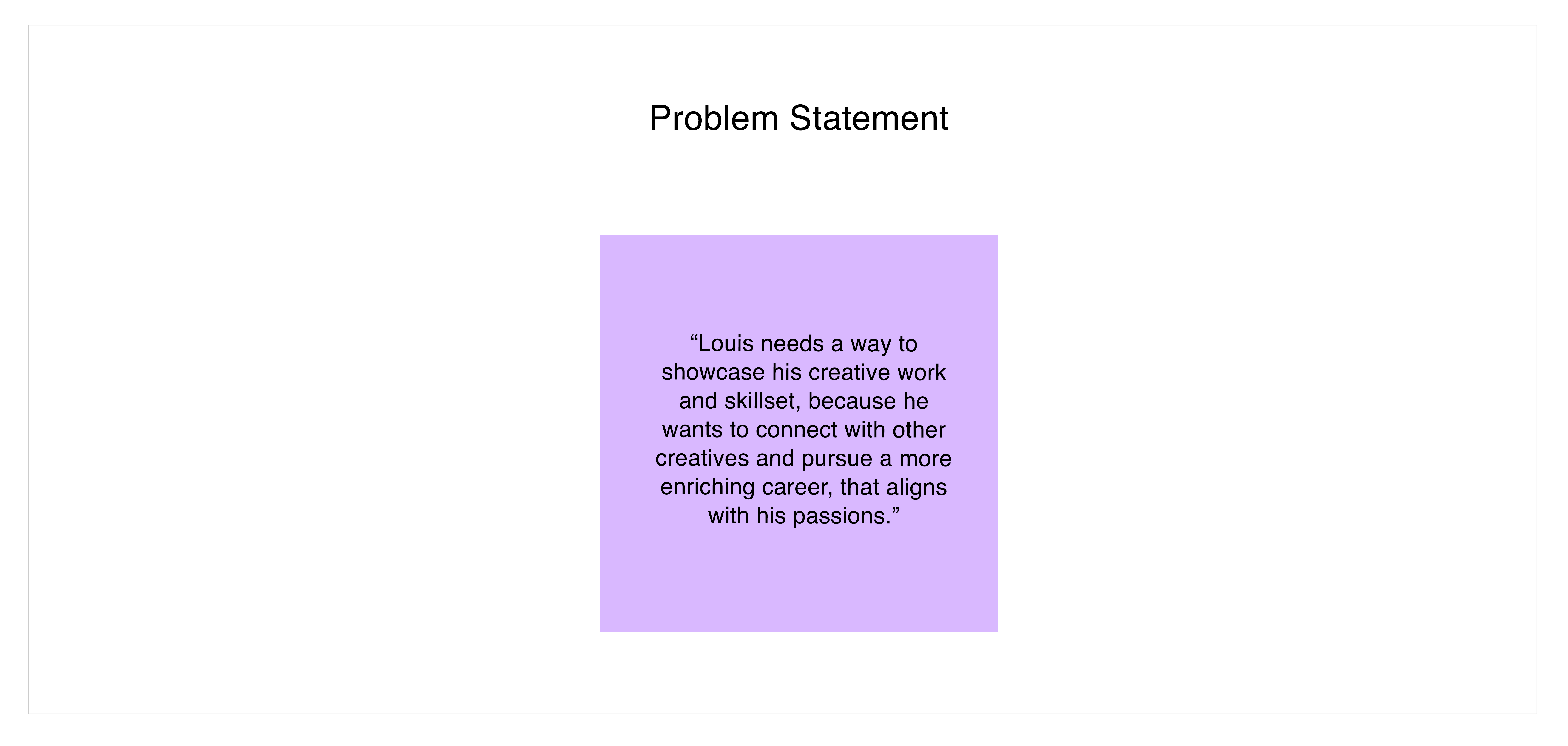
In building the problem statement, I primarily considered Louis’ goals of showcasing his media rich creative work, connecting with community, finding resonant projects to collaborate on, and transitioning into a career that aligns more with his passions.
I kept Lia’s perspective in mind, too.
![Problem Statement.jpg]()
Tools:
+ How Might We...?
+ User Flows
+ Usability Testing
+ How Might We...?
+ User Flows
+ Usability Testing
︎ Design
I moved into the design phase excited to craft opportunities for Louis and Lia to browse creatives by their projects, discover inspiration and talent using visuals-based guidelines, and connect. I felt certain that a key feature for Louis, our primary focus, would be some rendition of a navite portfolio feature. This feature would allowed him to share his creative work to attract opportunities, while keeping certain posts private.
I moved into the design phase excited to craft opportunities for Louis and Lia to browse creatives by their projects, discover inspiration and talent using visuals-based guidelines, and connect. I felt certain that a key feature for Louis, our primary focus, would be some rendition of a navite portfolio feature. This feature would allowed him to share his creative work to attract opportunities, while keeping certain posts private.
︎How Might We...?
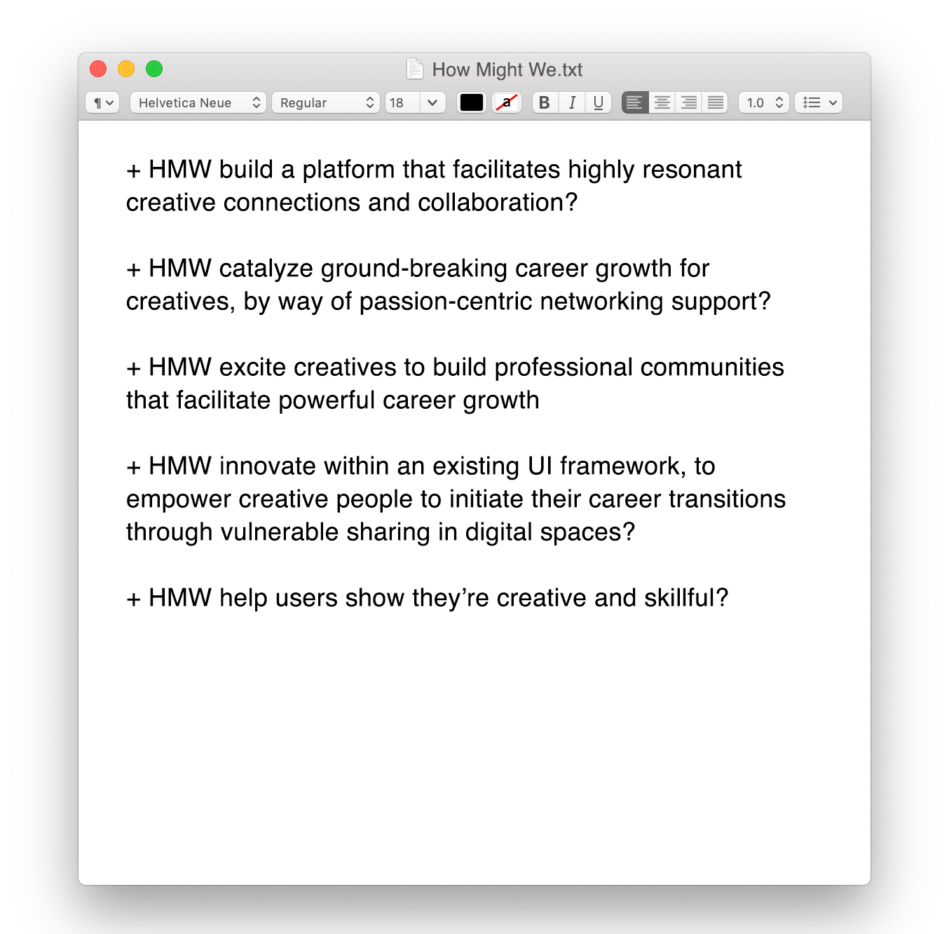
As an expansive tool for my frame of mind, I began the design phase with How Might We (HMW) questions. The five quetions below are my favorites.
![How Might We.txt]()
Ideation around these questions led to some interesting ideas:
Overall Concept:
+ A creative “mode” for LinkedIn creative-oriented UX-similar to IG’s business accounts.
Discovery:
+ A discovery page adapts Instagram’s carousel gallaries to LinkedIn–allowing users to quickly view creative projects.
+ Carousel galleries are stacked and organized by category.
+ A filtering system for the galleries.
+ Options to like and save projects.
Portfolio Profile and Media Rich Customication:
+ Customizable privacy settings.
+ Showcasing users’ creative skills with hashtags or badges.
+ Portfolio profile that are rich in creative media and modular.
+ Projects in user’s portfolios take up full page. Visuals’ importance is emphasized by large sizing.
+ Users can toggle between a creator’s résumé and portfolio on their profile.
Community and Opportunity:
+ A forum style community page offers users the opportunity to connect.
+ A comments section at the bottom of each portfolio project allows for connection
around growth, opportunity, celebration of work.
+ The ability to tag project collaborators in portfolio projects.
︎ User Flows
With initial ideation in mind, I created two user flows. User Flow 1, takes us through the choices and steps involved in sharing creative work on Linkedin–based on Louis’ needs. In User Flow 2, we navigate finding creative talent through projects, and categorization filters–according to Lia’s needs.
![User Flow 1.jpg]()
![User Flow 2.jpg]()


︎ Usability Test
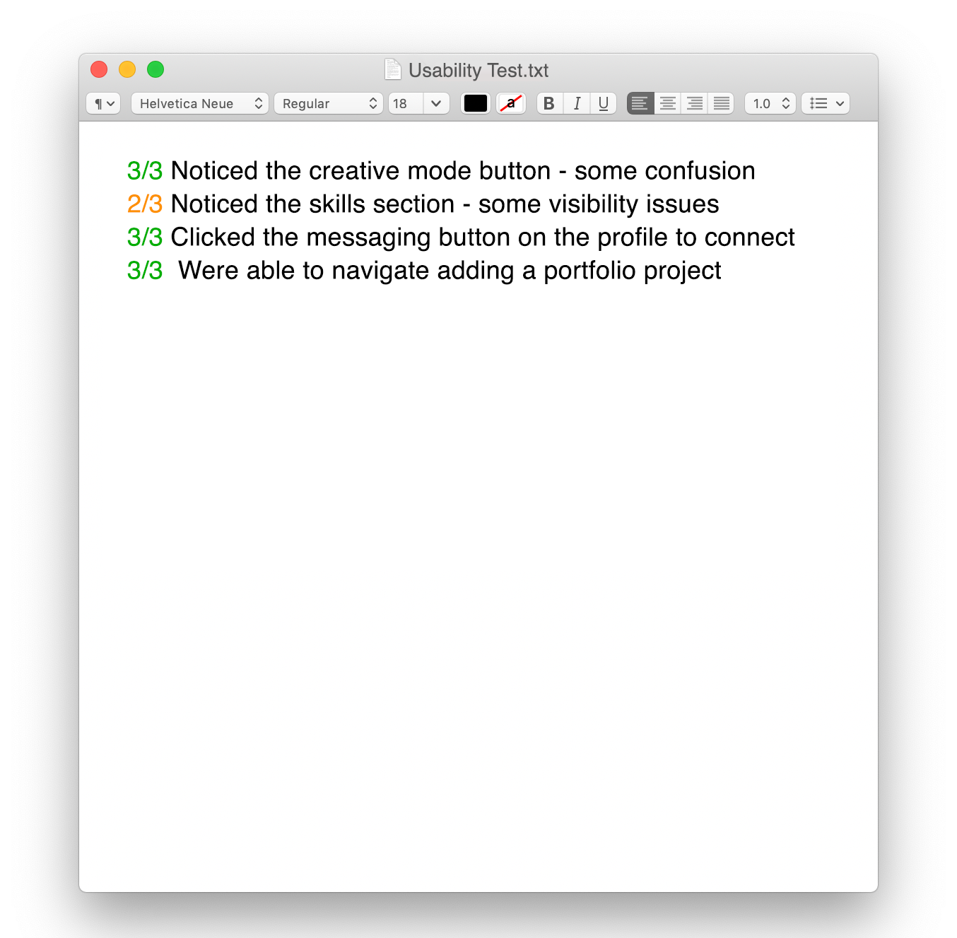
Observing how users moved through the initial design prototype, based on user flows, revealed the challenge areas in the UX and UI. I presented users with scenarios that utilized prospective features; creative mode, finding creative talent through a discover page, creative filters, a skills section on users’ profiles, and a profile portfolio.
![Usability Test.txt]()
Scenario Overview:
+ Testers were instructed to search LinkedIn Creative for a candidate to collaborate with.
+ They were instructed to check a prospective’s profile for appropriate technical skills for a digital painting opportunity.
+ After ensuring the candidate had the appropriate skills, testers were asked to message them to invite them to collaborate.
+ Finally they were asked to show how they would upload a finished collaborative work.
During the tests, I observed:
+ How testers navigated the new creative mode of the LinkedIn platform.
+ How testers searched for specific talent using filters.
+ How testers vetted creatives based on their skills.
+ How testers uploaded finished collaborative projects.
Throughout the sessions, I monitored how confidently users noticed and engaged with the new features associated with the tasks. There were some visibility issues around the skills buttons. I increased the contrast around shape and color there, and readied the design for delivery.
︎ Prototype
The final prototype for LinkedIn Creative proved a success for both creative users and their talent manager counterparts.
Users were able to confidently navigate through the two key flows; to discover and connect with creative talent and community, express themselves meaningfully through their profile portfolios, and share their work with care and intention around privacy.
Discovery
Users navigate to LinkedIn Creative via the ‘creative’ button in the top navigation bar. Carousel galleries featuring creative projects and their makers are organizable by industry, location, experience level, and skills.


Profile Portfolio
Creatives are able to express themselves and connect with community in a meaningful, passionate way through their profiles. Profiles boast ample space for project showcasing, creatives’ skills, custom privacy settings, and messaging and tagging features. Rich media sits front and center.
![]()
![]()
![]()
Creatives are able to express themselves and connect with community in a meaningful, passionate way through their profiles. Profiles boast ample space for project showcasing, creatives’ skills, custom privacy settings, and messaging and tagging features. Rich media sits front and center.


Customization and Privacy
Customizable media blocks allow users to upload videos, photos, audio, and text. They can also tag collaborators and customize privacy settings for each project.
